Marketing Services > Presentations
We have all seen them. For most of us, we have been responsible for the creation of them. But who is really to blame? Microsoft? Maybe. After all, is not PowerPoint the very bane of good design?
At Deckers' we take pride in creating slide shows that do what they are suppose to do. Tell a story and keep your audience captivated. From academic presentations that discuss psychology to venture capital investment pitches our experience and sense of design allows you to focus on giving that great speech while we put our expertise to work for you in the background.
Slide-shows are not something new. People have been presenting and speaking in public for a very long time now. What is new, is the technology we now use when we give a speech or presentation. And let's be real, most people have never had any formal training in how to design effective, intelligent, and captivating presentations using either Microsoft PowerPoint or Apple KeyNote.
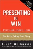
Listed below are what I consider the essential reading for learning how to design and give effective presentations. Want a good example of how a presentation should look? Just do a Google for Steve Jobs from Apple Computers and view any of his KeyNote presentations from the past 5 years - or check out YouTube for these examples. Or take a look at the links provided to your right, under the heading of How To Change the World.
As Guy Kawasaki has stated previously, the "four horsemen of presentation skills are:
These four horsemen all have their own idea of what a slide show should look like, and yet there are common ideals that they share. Guy Kawasaki recently interviewed Nancy Duarte, and in the interview she explains why she thinks so many slide shows "suck". Nancy has also posted a PDF which shows the before and after of the presentation her firm did for Guy. You can view it here. For some other ideas, check out Garr Reynolds sample slides here.
A good presentation should tell a story while it keeps the audience focused on what the speaker is saying. It should incorporate your branding, utilize professional photos and stock (not that evil clip-art that comes with your copy of Microsoft Office), it should ideally employ a unique theme so that it doesn't leave the audience thinking of previous presentations, and it should be targeted to your audience.
The rules of great presentations that we use are:
-
No fonts under size 30.
-
Custom themes that reflect the client's brand.
-
Bullet points are evil. Use as few as needed.
-
Whenever possible use professional photos, or create slide-show specific photos.
-
If you have an hour to present, keep your presentation to 20 minutes.
-
The text on the slide should not be the only thing said. This means, just don't read the slide.
-
When possible, have an Agenda slide at the beginning so that the audience knows what to expect.
-
Always finish off with a "Thank you" slide.
-
Employ professional designers and graphic artists in the design of the presentation. Yes, it costs money, but it does make a very big difference.
-
Create a Quicktime movie and/or PDF of the final slide show that you can email to people, or that audience members may view at a later time online.
There are exceptions. For academic and scientific presentations which present unique challenges, get a copy of The Craft of Scientific Presentations: Critical Steps to Succeed and Critical Errors to Avoid.
Portfolio Examples


